SchoolTool UI Update
Challenge: How might we update the SchoolTool UI without drastically changing the existing UX?
Background: The SchoolTool Student Management System (SMS) was built in 1994 in response to an RFP from a local school district. Since then, it has grown to be the most trusted SMS in New York State for K-12 schools. With heavy saturation in upper and central New York, the sales team was having trouble penetrating the western and downstate (Long Island) regions. Why? Despite the robust functionality of the platform, the look was severely outdated. The user experience was lacking in continuity and ease of use.
Process: SchoolTool leadership decided to invest in updating the overall look and feel of the product by bringing on a dedicated UX Designer (me!). With almost 30 years of user feedback to sort through, there was ample data to support the need for an updated look and feel. I started by working with the Service Delivery and Documentation teams to better understand what they were hearing during onboarding and training and technical support tickets. Using the most recent brand guidelines, I developed a Figma style library to define the typographic styles, color palettes, and styles for other UI elements including buttons, forms, tables, and icons. The style guide also includes hover, focus, and disabled states, all of which were previously undefined in the product.
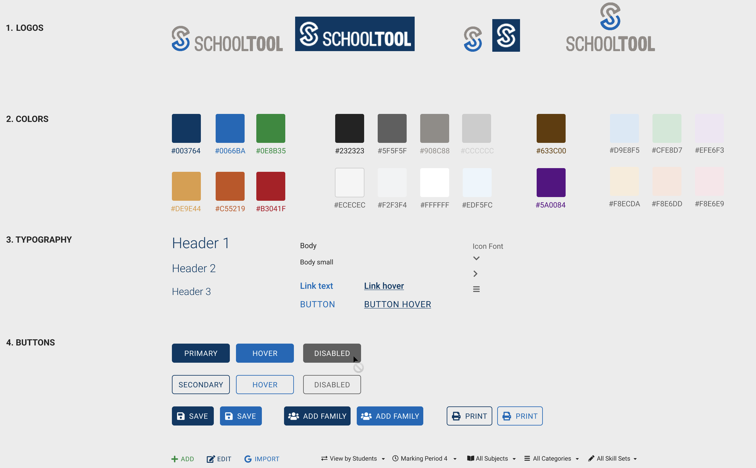
Style Library in Figma

Initial accessibility test performed using WAVE browser extension in Chrome.

Previous: Failed contrast tests on colors.

Current: Improved contrast to obtain AAA rating on WCAG.
Implementation: The engineering team set up a test environment where I was able to work with the existing global stylesheet. By updating this one CSS file, I was able to making a significant impact in the overall look and feel. This also gave us a working prototype that could be replicated in testing environments. We then sought feedback from end users during our weekly calls with some of the main administrators of the product. This served as our focus group to validate the design updates.
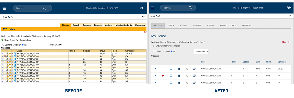
Teacher Home
“Overall, I like the new aesthetics and overall look!”
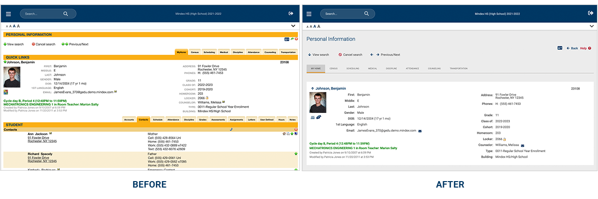
Student Record
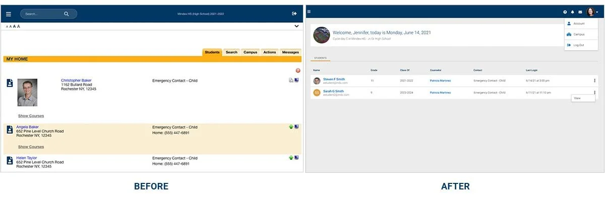
Parent Home
Outcome: In addition to many positive anecdotal responses, we also sent out a survey following the release of the UI updates. The overall response was “very satisfied” with the changes. Most importantly, the sales team has been able to reopen conversations with previously stagnant leads by showcasing the new look of SchoolTool. Accessibility was improved, reducing errors from 83 to 3, 94 alerts to 11, and contrast issues from 13 down to 1. The base design-language has been established with all the engineering teams increasing the velocity that UI changes are able to be made.
“Love the overall new updated look of SchoolTool.”